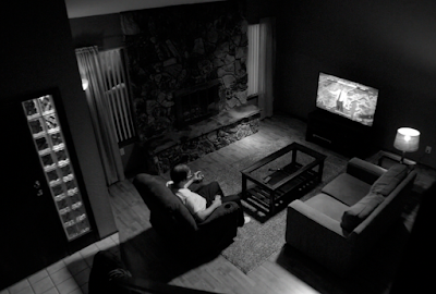
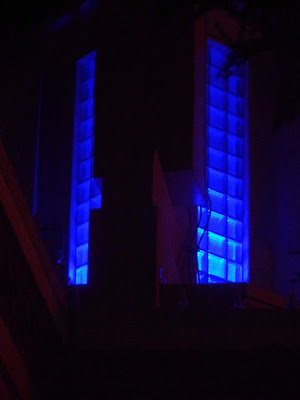
I was quite struck in "Better Call Saul" by their design team's widespread use of glass block and glass block walls. Sometimes there are just a few glass blocks; sometimes many. Sometimes (like the scene at Chuck and Jimmy's mom's bedside) the glass walls become oppressive. Vince Gilligan and his team pay very close attention to detail and locale, so I know the glass block walls must mean something more than Art Deco frippery. But what?
I think the answer is here. The popularization of Art Deco glass block walls in Albuquerque architecture (like in other American cities) came via the crowd-pleasing thirteen houses of the future displayed at the 1933–34 Chicago World’s Fair “Century of Progress International Exposition”. Glass block walls gave certain Albuquerque houses a kind of avant garde 20th-Century sensibility that people really liked:
The 1933–34 Chicago World’s Fair buildings, at the time considered the height of American modernity, influenced United States architectural design for many years thereafter.... That fair, called the “Century of Progress International Exposition,” which had been planned before the crash of 1929, opened in the middle of a worldwide economic crisis. Despite that fact, or perhaps because of it, the Century of Progress resolutely focused on an optimistic vision of the United States yet to come, a premise that proved wise: it attracted so many visitors that organizers kept the fair open for a second year.
One of the 1933 fair’s most popular exhibits featured thirteen futuristic houses clustered together on the shores of Lake Michigan. Those houses, built from innovative construction materials and with several examples clearly paying homage to the European “International Style” or the colloquial “Streamline Moderne,” turned out to be crowd pleasers. Few fairgoers actually contemplated living in homes like George Fred Keck’s Glass House, a three-story, glass-clad, polygonal tower suspended from a central pole that clearly owed a lot to Le Corbusier’s idea of the house as a “machine for living,” but most attendees marveled at the technology displayed within and without. Keck’s house controlled its own climate via central systems and sealed windows. It included not only a garage for the car but a hanger for the family plane. Keck’s design, which the fair billed as the “House of Tomorrow,” made the June 1933 cover of Popular Mechanics. The idea of an “automatic” house that heated and cooled itself, rotated to face the sun, and opened its own venetian blinds caught the fancy of fairgoers. It likewise influenced architects throughout the United States in the subsequent years before World War II. Bits and pieces of the fair’s dramatic architecture showed up on the cultural periphery, even in places like New Mexico, a location that many Americans thought was not even part of the United States, and even in Albuquerque, its largest city but one that contained only about 30,000 inhabitants in the mid-1930s. One of those architects, William Burk, Jr., a local practitioner in Albuquerque, demonstrated this far-flung influence and the way it transformed residential architecture in the United States. He brought the design elements of both the International Style and the more mass-market-oriented Streamline Moderne style together in the house he built on Hermosa Drive SE in the late 1930s, in the city’s Granada Hills district, the subject of this case study.
In a town full of faux-adobe casitas, Burk’s white stucco construct, featuring a wall of windows on its downslope side behind a glass brick prow aimed toward Highland Avenue (now Coal Avenue), was like no other dwelling in the city. Burk’s second floor, flanked on both sides by the railings of the roof decks, looked more like the bow of the Ile de France than it did a dwelling, at least from the south side. Since it stood on a treeless hill with almost no other houses around it, the house attracted a lot of attention even before completion. The only structure it resembled for most observers was the Phillips 66 service station on nearby Central Avenue that, not so coincidentally, Burk had also designed.
 I suspect the glass block walls in "Better Call Saul" signify the Chicago past Jimmy McGill can't escape. No matter where he goes and what he does, he will always and forever be "Slippin' Jimmy".
The design team's intention has been clear from the start. Here is Gene's Omaha apartment living room ("Better Call Saul", Season 1, episode 1, 'Uno'). There is a glass block wall.
 Glass block windows, a significant part of the background in the Alley scene near Third Street and Central Avenue, behind Jimmy John's Pizza ("Better Call Saul", Season 1, episode 4, 'Hero' and episode 10, 'Marco').
That telephone building also has other glass block windows.
 In the episode "Marco", the Chicago Bar is fitted with glass block windows in a repeating 3-4-5 Pythogorean Triple pattern. These guys are subtle.....
Albuquerque Examples of Glass Block Walls
 The former Brasserie La Provence restaurant, soon to reopen, features self-conscious International Style Art Deco storefront.
 Barrymore's Antiques, on Morningside SE (just one block from Walter White's (and Vince Gilligan's) apartment.
 Barrymore's Antiques, on Morningside SE (one block from Walter White's (and Vince Gilligan's) apartment.


No comments:
Post a Comment